Design Basics: Color Schemes via Color Wheel
When you are beginning a new design, whether it be for a new client or for your own home renovation, the process can be daunting. Let’s face it, the design industry is huge and the possibilities are pretty much limitless when you’re choosing furnishings, lamps, tile (as you’ve already learned by now you smart reader, you), etc. With every design, you have to start somewhere, and I often like to start with color.
That being said, I thought it may be time to give a quick tutorial on choosing foolproof color schemes.
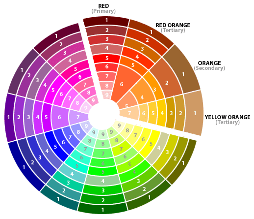
There are many different color wheel relationships that can help you to pick a gorgeous color scheme for your home, but I’m just going to cover the four most common: Monochromatic, Analogous, Complementary, and Triadic.
Hopefully, this will at least give you somewhere to begin!
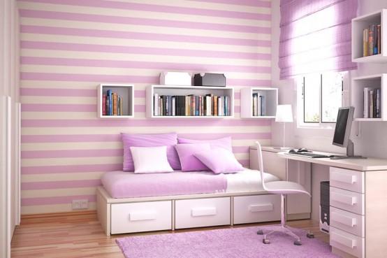
Monochromatic color scheme
A monochromatic color scheme consists of multiple shades of the same basic color (i.e. lavender, purple, aubergine). These color schemes are probably the easiest to pull off and coordinate. They can, however, come across as quite plain without the diversity of multiple hues.
Analogous color scheme
Analogous colors are colors that are adjacent to each other on the color wheel. Analogous color schemes are extremely pleasing to the eye as they are frequently found in our natural environment. Using an analogous scheme tends to keep a more cheery atmosphere, but when choosing this scheme, be sure to choose one color as the primary hue.
Complementary color scheme
Complementary colors are opposite one another on the color wheel, such as red and green, or orange and blue. Because the two colors are opposite one another, they create a high contrast which gives a very energetic look. These schemes can be a bit trickier to pull off without looking too overwhelming. The key is to use them in smaller elements, as depicted below.
Triadic color scheme
Tri-, meaning three, colors make a triadic color scheme. These colors are equally spaced from each other on the color wheel, creating a sort of triangle. These schemes are also very high contrast and extremely bright if used in saturated shades. Your best bet when designing with a triadic color scheme is to choose one hue to be the dominant color, and accent with the other two.
If you would like assistance planning your next project, email me at tiletramp@gmail.com for a free consultation!
Comments
3 Responses to “Design Basics: Color Schemes via Color Wheel”Trackbacks
Check out what others are saying...-
[…] 1) via TileTramp | 2) via Just Flew the Coop | 3) via berdhousegallery | 4) via Room for Young […]











Thanks for explaining a complex theory in a simple, easy to understand way. I personally find color scheming daunting. I usually look at ready made color schemes from nature or culture as inspiration. http://colorpilgrim.com has some great resources for color schemes.
Thanks for the comment Anne! Color scheming is definitely daunting…there’s just too many of them out there! Stay tuned for my upcoming post about how different colors convey different emotions as well 🙂