Design Trend Alert: Pink (Yep, You Read That Right)
I needed to post about something bright and cheerful (although don’t know if I can top the Andy Warhol flooring) since where I live it has rained nonstop for quite literally weeks.
Day. After. Day.
Gray…gray…gray…
Did I mention that I don’t have a car?
So, this week we are starting with one of the biggest 2011 trends: pink.
Yes, pink.
I never thought the day would come when the word “trendy” and “pink” would be used in the same sentence when discussing home trends. I think the pains of mid-century design (i.e. pepto bismol tile, bathtubs, etc.) had traumatized me from even considering pink as a design element ever again.
However, as of late, it’s difficult to ignore the amount of pink that I’m seeing everywhere I go, including in my last post featuring the new Warhol-inspired porcelain floor tile with not one, not two, but three different shades of pink.
Personally, I’m ok with this trend as I am, and always have been, a huge fan of pink.
Sidenote: did you know that pink is the only color in the color spectrum that inhibits violence? I actually can’t verify that that’s true, but it’s a nice thought, right?
Anyway, when Pantone announced that their color of the year was Honeysuckle, pink’s fate was pretty much sealed for 2011. We are seeing it in everything from paint, to furniture, to tile and I could not be more pleased!
I will tell you right now, the most effective and seamless way to incorporate this color in your home is through European elements.
Think baroque.
Think flamboyant.
Think dramatic.
This isn’t a color for the faint-hearted.
It would be much trickier to weave pink into a more traditional home (trickier, not impossible) but if you are a fan of the shabby chic or utterly glamorous style variety, this is the perfect opportunity to bring out your inner flamingo.
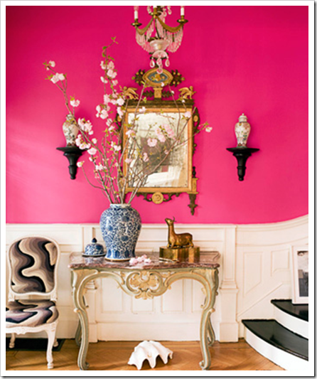
This is probably my favorite way to incorporate pink: wall color. While it’s true that painting is not a fun task, it is the easiest to change out when you get bored of a color. Personally, I don’t think I would ever get tired of Benjamin Moore’s “Razzle Dazzle” in a dressing area or front room as pictured above. I love it with hints of black and a heavy dose of baroque Parisian style.
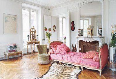
Can I just say…holy dream living room. The pink was the perfect choice for the seating in this Parisian sitting room. Upholstering a piece of furniture in pink is a great way to bring a bit of happiness into a room. This room without the pink lounge would still be beautiful, but wouldn’t pack nearly as much of a punch.
Here, pink is used as purely as an accent color. This room stands on its own without the pink chair, but the pink definitely gives the room a bit more “oomph”. The pink is carried on in smaller accents with the displayed conch shells and decorative box under the shelving. Again, this color thrives in a Parisian-styled room.
So, what does this have to do with tile? Well, in case you hadn’t read between the lines by now, home design trends directly correlate with tile trends. The keyword here is “trend”…if you are of the “classic and timeless” variety, I do not recommend buying into this trend because this is absolutely going to be “so 2011” in ten years.
However, regardless of your plans to incorporate pink or avoid it altogether, anyone can still appreciate the unique qualities it brings to a room.
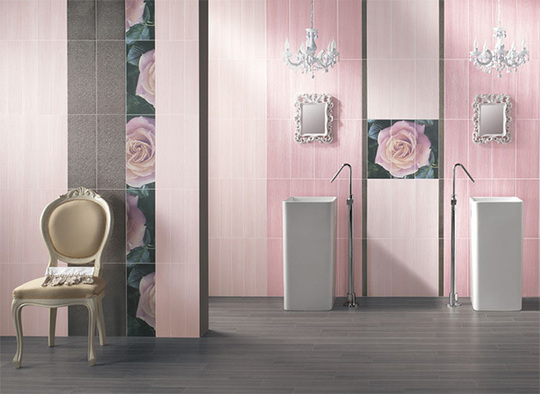
Even in tile, pink works best with Parisian elements such as the Louis chair to the left and the baroque mirrors and elaborate chandeliers hanging above the sinks. The lighter shades of pink porcelain wall tile create a soothing and distinctly feminine mood in this washroom.
These photos are great examples of pink being used in modern applications. While it’s a bit more pink than I think even I could handle, it nonetheless creates a fun and lively atmosphere. The pink tile used in a penny round format for the kitchen backsplash reflects the light nicely and keeps the area bright, a beautiful contrast with the dark cabinetry.
This is an Italian bathroom done in a 1″x1″ glass mosaic gradient. Italians are notorious for designing with large splashes of color. As much as I love pink, I’m not sure this is a look that I would recommend for Northern America applications, although I do think it would be fun in some commercial applications, i.e. a ladies bathroom in a boutique or trendy restaurant.
All in all, I think pink is a great design color for adding a sense of playfulness and glamour to a room, but it definitely isn’t for everyone. As I previously stated, if you’re on the fence about introducing pink, start small with some upholstered pillows or a throw, and take it from there.
And if you would like some help incorporating pink successfully into your space, feel free to email me at tiletramp@gmail.com for a FREE consultation!


